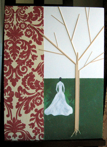
This was a chance to play around with some ideas I’ve been toying with for awhile… I like the idea of using printed fabric as a background, and I had some scraps left over from the curtains I made last year, so that was my start (though I ended up feeling like the damask I used in this was so bold and contrasty that I didn’t want to paint over it). The tree was also the product of some scraps I had laying around – I have a bag full of basswood pieces left over from my days as an architecture student, so this put some of it to use. I painted the woman pretty quickly (used a picture from one of my old bridal magazines as inspiration), but the background is where I really got stumped. The first time I painted it, it was too monochromatic. So I layered another shade of green over it. Then it was too varied. Then it was too light, too dark, too green, too yellow, etc. There are probably about 12 layers of green paint on this canvas. Last week I finally just threw my hands up, squeezed a bunch of green and yellow and red and white paint onto my palette, mixed it all together, and started slapping big daubs of acrylic onto the canvas with my palette knife. I’m not totally satisfied with the effect, but I don’t know where else to go with this one, so I’m setting it aside for now and moving on (more ideas brewing…).
Tiff says:
I think it’s beautiful!
March 14, 2008, 5:30 am