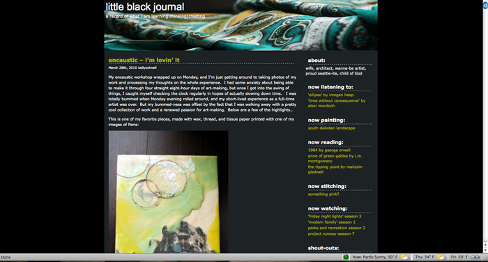
Three or four months ago, I started thinking about a blog redesign – Little Black Journal is now over two years old, and has been in need of a little refresh for awhile now. For any of you readers that follow me via Google Reader and haven’t been to the site in awhile, this is LBJ, circa yesterday:
As I was laid up on the couch last night with a mild case of the cold flu, motivation took the place of procrastination, and I spent several hours tracking down a decent template, tweaking the heck out of the one that came closest to my ideal, redesigning my header, and testing it all out on the beta site that my uber-techy husband set up for me. And now…Voila! I’m pretty happy with the direction I’m moving in – the new site seems cleaner, fresher, and allows for larger photos than my old layout could support. The header is also a great place for me to ‘showcase’ some of latest artwork and will be updated periodically. Also, FYI, I have started linking my photos to my Flickr page, so if you want a larger-format photo, just click on the image in the body of my blog.
I’m still fiddling around with a couple of minor things – fonts, text color, margins, etc., but I’m gettin’ there. Don’t hesitate to leave me a comment if something seems funky – I am by no means a web designer or graphic guru, so feedback is always welcome (I just spent a couple minutes opening my blog on 5 different web browsers and it looks different on every single one – I feel your pain, J!).
It’s an improvement, though, no?

Jason says:
Thanks for feelin’ it Kel! I like the new look — the header really sets it apart. Nice work.
April 1, 2010, 12:26 pmbrieanne says:
love it! looks very fresh, unique, simple and beautiful
April 3, 2010, 9:24 pm